I could never hope to get my hands on a smartphone(after my crazy expenses this year), let alone a Lumia. Then an ever helpful friend Manish, from Office stepped in and bought one off Flipkart for me!
Why Lumia 800? : One word. Design!
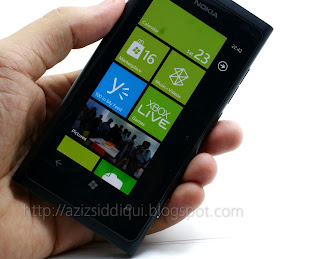
I have always been a fan of elegant, minimalist design this device is an epitome of all that is simplistic yet elegant. A straight pick up of the iconic but ill fated Nokia N9, this one differs only in the screen real estate - losing 54 horizontal lines to make way for 3 capacitive buttons.
What better place to get better specs info this here!
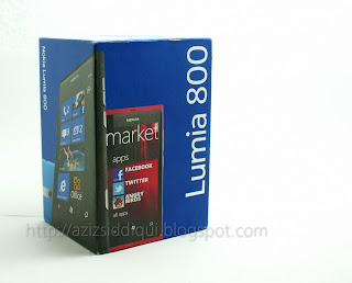
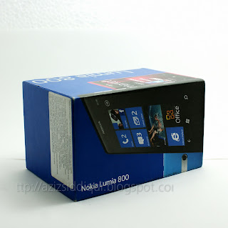
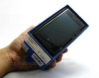
The box itself is a no-frills hard cardboard unit with a slide out arrangement for the handset and other stuff
 |
| Minimal. Beautiful. |
 |
| 3.5mm headphone jack and the USB port+SIM slot sit flush with the body |
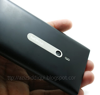 |
| 8MP camera with Zeiss optics: My biggest complaint about the device. It plain sucks But hey, there's dual LED flashlight FTW! |
 |
| Weight is a tad on the higher side... no qualms though. adds to the whole appeal |
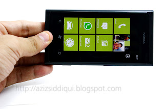 |
| Screen is a beauty. You cant tell where it meets the bezel...the black levels are that great |
 |
| users have complained of the flimsy door to the USB port. I haven't(till I break it maybe) |
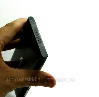 |
| Even the speaker holes are machined! Beat that. |
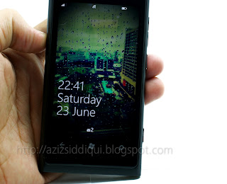 |
| Lock screen. That wallpaper is the view from office |
 |
| The software will require another post. Coming soon. |



No comments:
Post a Comment